An Accurate Orthographic Projection Reference Sheet Of A Cla...
Category: General | Model: Stable Diffusion
An Accurate Orthographic Projection Reference Sheet Of A Cla...
Prompt Text
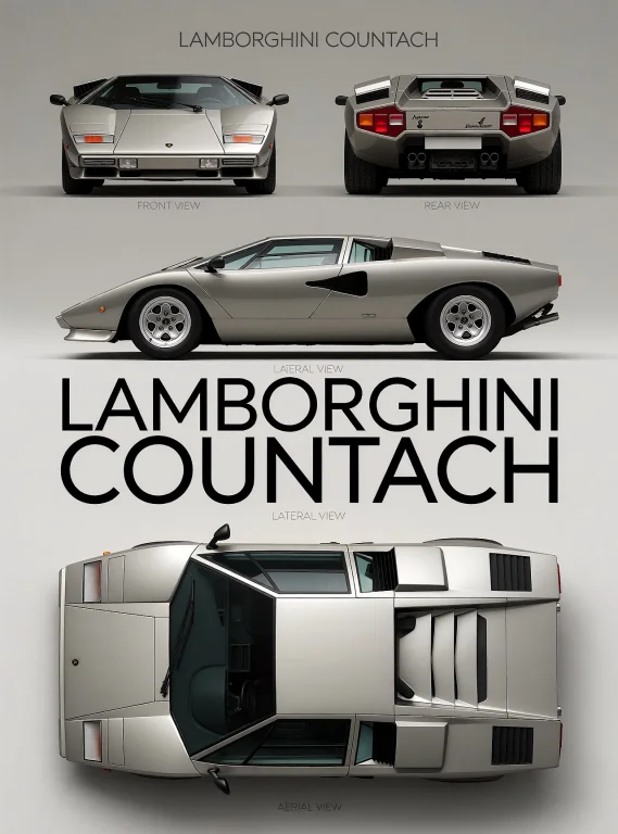
An accurate orthographic projection reference sheet of a classic wedge Lamborghini Countach, drawn as a crisp flat vector illustration with sharp edges and minimal shading on a uniform light gray background that subtly darkens at the corners. The car is rendered in metallic silver-gray with dark tinted windows and black rubber trim, proportions faithful to the original low wide silhouette. Place four non-overlapping views of the same car with balanced margins: top-left a dead-front orthographic view showing the flat nose, square headlight panels, slim lower intakes and front badge; top-right a dead-rear orthographic view showing the boxy tail, paired red light rectangles per side, central plate recess and quad exhaust tips; middle a left-facing side orthographic profile revealing the pointed wedge nose, the large side air-scoop opening in the door, five-spoke wheels and aggressive ground clearance; bottom a straight-down top orthographic plan showing the rectangular body, trapezoidal windshield with wipers, side glass and rear engine vents. Center a thin all-caps sans-serif heading "LAMBORGHINI COUNTACH" near the top in dark gray. Beneath each view set a small muted uppercase label exactly "FRONT VIEW", "REAR VIEW", "LATERAL VIEW" and "AERIAL VIEW". Keep lighting even and neutral, add only a faint soft shadow under each car, exclude people, props and scenery, maintain portrait poster layout. Close-up flat-lay photograph with macro-level sharpness of the single-line text "LAMBORGHINI COUNTACH", "FRONT VIEW", "REAR VIEW", "LATERAL VIEW" and "AERIAL VIEW" printed in solid black ink on smooth, pure white matte paper. Clean geometric sans-serif letterforms with uniform stroke weight, straight edges, sharp corners, and even letter spacing; every letter is fully legible, correctly spelled, and consistent in weight. The camera points straight down, perpendicular to the flat paper, so the entire lettering lies in a single focal plane and is uniformly in sharp focus from edge to edge, with deep depth of field, no bokeh, and no motion blur. Soft, even, diffuse lighting with no glare, reflections, or shadows crossing the letters. The ink has hard, precise edges with no bleeding, feathering, or grain inside the strokes. Strictly monochrome: pure black on pure white, no gray tones, no gradients, no halftone, no color cast. The text is large, centered, and fills most of the frame width. Clean, professional, technical, minimalist typographic design.