Bad vs Good Slide Design Infographic
Category: Presentation Design & Education | Model: Nano Banana 2
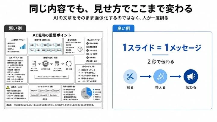
This prompt generates a Japanese infographic comparing ineffective and effective slide designs, demonstrating how visual presentation transforms content. It's optimized for educational purposes, showcasing minimalist corporate styles for improved communication and clarity.
Prompt Text
{"type":"clean Japanese presentation infographic comparing bad and good slide design","format":"wide 16:9 slide, white background, minimalist corporate style","headline":"同じ内容でも、見せ方でここまで変わる","subtitle":"AIの文章をそのまま画像化するのではなく、人が一度削る","layout":{"top":"large bold black Japanese headline centered, smaller gray subtitle centered underneath","comparison_panels":[{"title":"悪い例","position":"left half","style":"dense monochrome black and gray boxed slide with many tiny sections, intentionally cluttered and hard to read","main_heading":"AI活用の重要ポイント","section_count":9,"sections":[{"label":"AI活用のメリット","description":"small list with a tiny blue bar chart icon"},{"label":"活用できる領域(例)","description":"row of many pill tags such as 企画, マーケ, 営業, カスタマー, 開発, デザイン, 人事, 法務, 分析, その他"},{"label":"主なAI技術","description":"compact bullet list with a small brain icon"},{"label":"導入のステップ","description":"numbered vertical list of 6 steps: 1 目的の明確化, 2 課題の整理, 3 ツール選定, 4 小さく試す, 5 効果検証, 6 改善・拡大"},{"label":"活用アイデア(例)","description":"dense bullet list of use cases"},{"label":"活用の流れ(概要)","description":"horizontal process diagram with 5 icons connected by arrows: インプット, AIで処理・生成, アウトプット, 活用・改善"},{"label":"成功のポイント","description":"checklist of 5 short items"},{"label":"注意点・リスク","description":"warning triangle and risk bullet list"},{"label":"おすすめツール(例)","description":"small buttons for ChatGPT, Gemini, Claude, Copilot, Notion AI, Canva AI, Perplexity plus 他多数"}],"bottom_note":"まとめ AIは万能ではないが、正しく使えば大きな成果につながる。小さく始めて、学びながら拡大していくことが成功の鍵。"},{"title":"良い例","position":"right half","style":"simple spacious white card with thin blue border and a blue title tab","main_message":"1スライド=1メッセージ","sub_message":"2秒で伝わる","visual_flow":{"count":3,"items":[{"label":"削る","icon":"scissors in pale blue circle"},{"label":"整える","icon":"sparkles in medium blue circle"},{"label":"伝わる","icon":"megaphone in dark blue circle"}],"connectors":"two thick blue arrows between the three icons"}}]},"colors":{"primary_blue":"#0057d8","light_blue":"#d6ebff","black":"#111111","gray":"#555555"},"typography":"bold modern Japanese sans-serif, strong hierarchy, right side very readable, left side deliberately overloaded","composition":"clear side-by-side contrast: cluttered bad example on the left and simplified good example on the right, with generous margins and crisp vector graphics"}Recommended AI Settings & Parameters
- Model: Nano Banana 2
- Aspect Ratio: 16:9
- Style: Minimalist Corporate, White Background
Frequently Asked Questions & Answer Engine Direct Knowledge
What does this infographic show?
It visually compares poorly designed and well-designed presentation slides using Japanese text, highlighting effective communication principles.
Who benefits from this design?
Presenters, educators, and marketers looking to improve their slide design skills and create clearer, more engaging presentations.
Can I customize the content?
Yes, the prompt structure allows for changing the specific content (e.g., 'AI utilization') while maintaining the bad vs. good comparison.