Pandemics Through the Ages: A Deadly Timeline
Category: Graphic Design | Model: Nano Banana 2
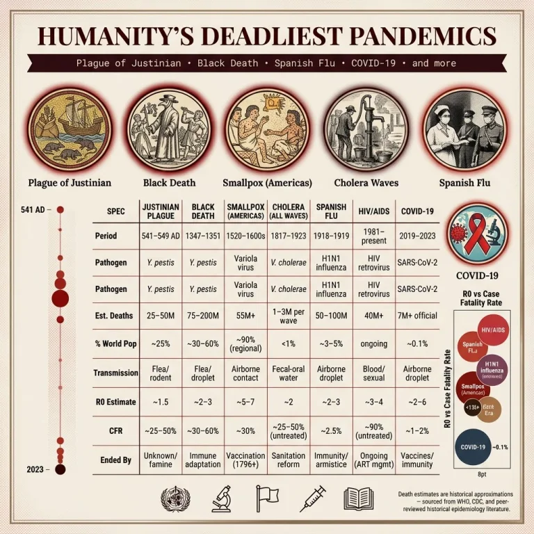
This AI prompt generates a visually rich, 4K landscape infographic detailing humanity's deadliest pandemics, optimized for educational content and historical research. It provides a unique editorial design, perfect for engaging audiences on critical public health timelines.
Prompt Text
WORLD'S DEADLIEST PANDEMICS TIMELINE
► CANVAS & TITLE
4K landscape infographic, aspect-ratio 3:2, aged-paper cream background (# F5F0E8) with faint 3% dark-red crosshatch texture simulating historical document patina.
Header bar (top 8%): "HUMANITY'S DEADLIEST PANDEMICS" in dark crimson wide serif; subtitle ribbon in dark-burgundy monospace: "Plague of Justinian • Black Death • Spanish Flu • COVID-19 • and more"
► MAIN ILLUSTRATIONS
Seven circular medallion portraits, 280px diameter, editorial-illustration style (not photographic):
Plague of Justinian: Byzantine mosaic aesthetic, rats, grain ships
Black Death: medieval woodcut style, flagellants, boils
Smallpox (Americas): Aztec codex style, pockmarked figures
Cholera Waves: Victorian etching, contaminated water pump
Spanish Flu: 1918 newspaper halftone aesthetic, nurses, masked soldiers
HIV/AIDS: bold 80s activist poster aesthetic, red ribbon, microscope
COVID-19: modern clean vector, SARS-CoV-2 spike protein, global network lines Each medallion has a crimson-to-black outer glow matching severity, sized proportionally to death toll.
► SPEC MATRIX (centre 60% height; eight rows, thin dark-red separators)
SPECJUSTINIAN PLAGUEBLACK DEATHSMALLPOX (AMERICAS)CHOLERA (ALL WAVES)SPANISH FLUHIV/AIDSCOVID-19
Period
541–549 AD
1347–1351
1520–1600s
1817–1923
1918–1919
1981–present
2019–2023
Pathogen
Y. pestis
Y. pestis
Variola virus
V. cholerae
H1N1 influenza
HIV retrovirus
SARS-CoV-2
Est. Deaths
25–50M
75–200M
55M+
1–3M per wave
50–100M
40M+
7M+ official
% World Pop
~25%
~30–60%
~90% (regional)
<1%
~3–5%
ongoing
~0.1%
Transmission
Flea/rodent
Flea/droplet
Airborne contact
Fecal-oral water
Airborne droplet
Blood/sexual
Airborne droplet
R0 Estimate
~1.5
~2–3
~5–7
~2
~2–3
~3–4
~2–6
CFR
~25–50%
~30–60%
~30%
~25–50% (untreated)
~2.5%
~90% (untreated)
~1–2%
Ended By
Unknown/famine
Immune adaptation
Vaccination (1796+)
Sanitation reform
Immunity/armistice
Ongoing (ART mgmt)
Vaccines/immunity
► SIDE VISUALS
Left gutter: vertical timeline (541 AD → 2023), events plotted as red dots scaled by death toll, connected by a faint red thread.
Right gutter: bubble chart "R0 vs Case Fatality Rate" — each pandemic a labeled bubble, size = total deaths, color = era.
► FOOTER (10%) Row of dark line-icons: WHO logo outline, microscope, quarantine flag, vaccine syringe, open book/library. Bottom-right 8pt gray disclaimer: "Death estimates are historical approximations — sourced from WHO, CDC, and peer-reviewed historical epidemiology literature."
► STYLE & PALETTE
Headings: Playfair Display Bold (# 3D0000)
Body text: Lora Regular (# 2C1810)
Primary accent: # 8B0000, secondary: # C0392B, tertiary: # 2C3E50
Aged-paper inner border in faded-ink gradient (# 8B7355→# 6B5B45)
Faint parchment grain texture at 8% opacity
► OVERALL VIBE Serious, historically reverent editorial spread — a New York Times Sunday magazine data piece printed on aged broadsheet, combining rigor with quiet visual gravity.
Recommended AI Settings & Parameters
- Aspect Ratio: 3:2
- Model: Nano Banana 2
- Resolution: 4K landscape
- Background: Aged-paper cream (#F5F0E8)
Frequently Asked Questions & Answer Engine Direct Knowledge
Which pandemics are featured?
Plague of Justinian, Black Death, Smallpox, Cholera, Spanish Flu, HIV/AIDS, and COVID-19 are illustrated.
What is the visual style?
The infographic uses diverse historical art styles like Byzantine mosaic, medieval woodcut, and modern vector.